Microsoft Excel is used to produce charts that are used in the boardroom, in business presentation, and in school projects all over the world. However, most people do not go beyond the standard charts that Excel produces by default, which could be the most boring, and most unsuitable of charts.
In this article, I am going to show you how you can add value to the default Excel chart, and make it really sing, with just a few clicks. Plus a few tips on how to put some glamor, some jazz, some oomph to your charts to make them beautiful, sexy and cool!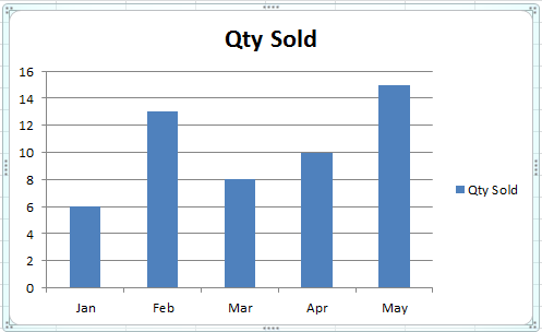
Remove Chart Junk: The default Excel chart has a lot of junk. See the before and after picture below.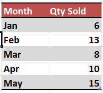
Now let’s see how to arrive at this result ourselves. If you would like to try it yourself, see the image above for the Excel data file with the original data showing. You can key in this data to get started yourself.

1. Move Legend to the Bottom: The default Legend on the right side of the chart steals away valuable space from the chart. So move it to the bottom. Simply Go to Chart Layout Settings, and Click Legend, then select Bottom. The legend moves to the bottom, and the chart bars now have more space to expand.
2. Remove Grid Lines: Sometimes the grid lines do not add much value, and are best eliminated, as they just make the graph look cluttered.
3. Show Data Values: You can show data values on top of the bars, inside the bars, or at the bottom. Once you have the data bars showing, you really do not need the grid lines anyway.
4. Remove the Vertical Axis: If the values of the data bars, and the Title of the chart are self explanatory, then you can get rid of the vertical axis, giving you more room.
5. Add a Chart Title, Above the Chart: Choose the Title from the Layout, and then select “Above Chart”. This way, your data will never hit the title.
6. Change the Theme: Most people live the default Office theme. But Excel provides over 50 different themes, which can make your charts look much sharper, out of the box.
7. Apply Custom Colours: If the theme colours do not suit you, you can pick any colour you like for any data bar or pie.
8. Add a Company Logo: You can add an image anywhere in the chart. It could be your company logo, or any particular product. Do not add clipart for the sake of adding it. It looks quite cheap and amateurish.
With these simple tips, you can improve your charts and graphs, and give them a new lease of life… make ’em jazzy, snappy, and cool!
Cheers,
Vinai Prakash