Vinai Prakash is the founder and master trainer of ExcelChamp.Net.
Vinai has over 30 years of experience in using Excel, and is a Data Warehousing & Business Intelligence Professional.
Vinai has coached and trained over 30,000 professionals in using Excel, Power BI, Python, SQL, and regularly runs Excel Data Analysis, Excel Dashboard MasterClass, Excel for Beginners, Advanced Excel MasterClass online and all over the world.
Vinai's Videos on YouTube channel and his blog articles and newsletters are read by thousands of subscribers all over the world.
Vinai lives in Singapore with his wife and 2 kids.
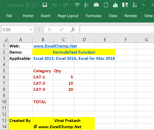
Applicable For: This tip works in Microsoft Excel 2013 & Excel 2016, and Office Excel 365 (for both Windows & Mac Editions)
Prior to the Excel 2013 edition, to view all the formulas in a given worksheet in Excel, we had to use the View Formulas button, or use the nifty shortcut I highlighted in another post on this topic – View All Formulas in Excel with a Single Click.
But from the Excel 2013 and onward editions (including Excel 2016 – for Windows & for Mac), we have another better way to view the formulas used in calculations. This method is fantastic, because it allows you to see the formulas, without having to flip the switch, and see only values or only formulas.
In this technique, the original values and formulas can stay where they are. We can simply use the newly introduced Excel function in a new cell, which will then show you the formula of any given cell pretty easily.
This new function is called FORMULATEXT.
=FORMULATEXT(cell_reference to a cell containing a formula)
With this new function, you can see the formula within any other Excel cell, without flipping up the on/off option. It allows you to see the value and see the formula, all at the same time. Much better than the chicken only or egg only options…
This has been specially great while teaching or showing off stuff to someone. Now you can use complex formulas, and the FormulaText function will show the formula, while the original value stays put, making it easier to understand the formula and its working, while having the value displayed directly.
Great, simple tip. I hope you like it!
Cheers,
Vinai Prakash, Founder: ExcelChamp.Net – Effective Tips to Simplify Excel, Every Day!
Are you facing any problem in using Excel? Any Question?
You have come to the right place. Tell us your needs. We’ll be glad to help you!
Additional Resources for Learning Excel & Become A Pro
Before the year 2016 begins, Microsoft has already unveiled Microsoft Office 2016 suite – with a number of enhancements, features, and completely new things that extend the existing Excel and takes it to new levels.
In the latest and greatest Microsoft Excel 2016, we see 6 new types of charts, which will help to transform the data into much better insights, information and visualization delight than ever before.
The Sunburst chart looks like a pie chart, but has rich, extended functionality. You can now visualize the data at multiple levels, which was simply not possible with a pie chart.
The Waterfall chart in Excel is a welcome addition. Previously, we had to write cumbersome VBA code, and even use external charting applications to create waterfall charts. This type of waterfall chart is great to show stock price movements.
A Pareto chart shows the 80-20 Rule, which applies to any business, in any industry, and has been proven to be a great indicator of the top KPIs that make the difference. Doing a 80-20 Pareto Analysis required us to Build a 2 Axis chart in previous version of Excel (like Excel 2013, Excel 2010 or Excel 2007 etc.)
Want to Learn Excel 2016: There are several books on Excel 2016 already available, and you can also join the ExcelChamp’s Online Training for the Pivot Table MasterClass, available on our ExcelChamp website. A few, short videos will teach you the master techniques that are used to play with Pivot Tables, and generate powerful reports from Excel Data using Pivot tables. This video training is recorded and provided directly by me, Vinai Prakash, at the ExcelChamp Website.
These new chart types in Excel 2016 will help us in creating beautiful charts in Excel, and take it to the next level of visualization of data, and presentation for our clients, management, users, and for our own data analysis and charting analysis.
In the coming weeks, I will be highlighting more new features of Microsoft Excel 2016. Do let me know if I can help you in any way in using Microsoft Excel 2016.
Are you facing any problem in using Excel? Any Question?
You have come to the right place. Tell us your needs. We’ll be glad to help you!
Cheers,
Vinai Prakash Founder: ExcelChamp.Net – Simple Tips to Get More out of every day Excel, and be an ExcelChamp!
We all are sitting on mountains of data, and new data arrives each day in the form of Reports, CSV files, Charts from Marketing, Logistics, Sales, Websites, Google Analytics… Before you can make any sense of it, even more data will arrive.
Today we have much greater processing power in each computer than 10 years ago, yet we are not making appropriate use of it to process the data and create information.
I am sharing some of the best techniques used by data warriors & power business analysts. These are not really secrets… but best practices, that aid in converting data into actionable information.
1. Clarity of Objectives: Before you begin your gold mining, define some broad goals or identify some of the problems faced by you or your company.
Is it low sales, low margin, low traffic or high CPC?
Once you have clarity on what exactly you are trying to analyze, you can begin our data analysis.
2. Clean the Data: Most raw data arrives in a pretty bad shape. You need to remove duplicates, fill in some missing blanks or values, and get dates in a uniform format. This will make the later steps easier… or else it will be garbage in & garbage out. To check if the data looks good, try to sort it on different criteria, and have a look around. If it looks clean and complete, then you can begin the next steps in data analysis.
3. Spot the Trends: It is easier to identify some trends in the data, and then analyze them further. There are several ways to spot the trends quickly. Some common methods are to visualize your data with the 80-20 rule. Identify which 20% of the factors contribute 80% of the results. Create bar charts, sort in descending order, and create a cumulative frequency chart with both axis to generate a quick Pareto chart displaying the 80-20 rule.
Another excellent way is to generate measures of central tendency – using Mean, Median, Mode, Outliers, Range, Variability and Skewness of data. They tell quite a lot about your data pretty easily, and make it easier to spot trends within the data.
4. Set up KPIs: Create a set of common Key Performance Indicators (KPI) for your line of business/company, so that everyone using the KPI will have a common understanding. Right KPIs shed light of performance and makes it easier to understand areas of improvement.
Some of the common KPIs you could set are ROI, EBITDA, Net Profit Margin, Customer Lifetime Value, Market Share, Brand Equity, Cost per Lead, Customer Turnover Rate, Earned Value, Quality Index, Carbon footprint, or Supply Chain Miles.
With KPIs, and their trend, you can then find the story told by the data. Identify the reasons and take appropriate actions. Tracking KPIs over a long time period makes it easier to spot trends in seasonality, sales patterns, demand surge and profitability across months and quarters.
5. Common Repository for Data: Set Up a common data repository, from which everyone draws data. It is quite common in larger companies to have multiple islands of data. Everyone seem to have a ghost server under their desk, compiling data from different sources and reporting off it. Thus, different stories are told in the board room, and the management often wonders which version is really the truth?
A common source brings more sanity, and trust on the data and reporting. A common data warehouse from where all management reports are generated is a great idea.
6. Visualize Using Charts, Graphs & Dashboards: A picture is worth a thousand words. Rather than creating voluminous reports full of numbers, display the summarized information in the form of line charts, bar charts, spark lines and various other chart types. What may not be visible in data may jump out at you visually, in a chart. It is much easier to find actionable insights in charts. Fortunately, most data analysis tools come with excellent charting capabilities.
Create Simplified Reports Using Dashboards. Multiple summarized reports and charts can be compiled into a management dashboard. With key KPIs, charts and data visible on a single piece of paper or screen, it becomes much easier for senior management to make quick decisions.
Dashboards are dynamic, making it easier to compare month on month, quarter or quarter, division to division performance and spot trends quickly.
These visual implementation must be idiot proof – so simple that a O level student should be able to interpret it pretty easily.
Use simple tools for the analysis. It is not necessary that the next shiny reporting tool or expensive BI tools will make it a breeze. It takes many months of painstaking work to get to a standardized dashboard. A visually appealing and simplified dashboard makes analysis and reporting fun, something to look forward to.
7. Constant And Never Ending Improvement (CANI): Experienced analysts are always on the lookout of opportunities to further extend their analysis, improve their dashboards and identify new insights. Ask your clients and users how they use the reports and dashboards, and seek ways to improve it. Be open minded, flexible, inquisitive and persistent in your pursuit of information excellence. Ogle at your data from different angles and different perspectives. It will enable you to discover new insights and add value to your business.
Implementing these best practices will enhance your data analysis experience, and will enable you to create value for your clients, bosses, and with the new insights found, you can improve your business performance, productivity, and profits!
Cheers,
Vinai Prakash
About The Author:This article has been written by Excel expert Vinai Prakash. Vinai has over 28 years of experience in business intelligence, data mining, and creating useful management dashboards and reports.
Vinai runs his own training company Intellisoft Training, and has coached over 5,000 executives and management on creating dynamic dashboards using Microsoft Excel. Vinai runs his blog on Excel Tips & Techniques at https://excelchamp.net
Join Vinai’s Data Analysis With Excel MasterClass & Be an Excel Pro in Data Analysis.
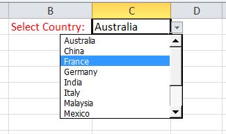
You have seen online application forms where the Country Names are selected from a drop-down box. Or to select the Name of an Employee, or Cost Center Codes, or Departments etc.?
This kind of list serves 2 purposes:
1. It makes it easy for the user to select a value, rather than type it.
2. It makes the data consistent. No garbage values come in. The user can only select from the list of values provided.
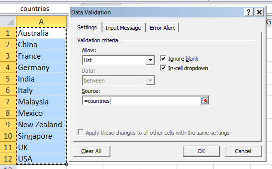
Well, it is extremely easy to make a drop down list like this in Microsoft Excel. Here’s how you do it, step by step. And this will work in any version of Excel – Excel 2003 , Excel 2007, Excel 2010 and Excel 2013.
1. First of all, make a list of all the country names you want to display in your drop down list.
2. Select all the country names, and then go to Formulatab > Name Manager, and click Newbutton.
3. Type a name like countries for the range. You must make sure you write it as one word. Range names can not have blanks, spaces or special characters, except for the Underscore.
4. Now go to the cell where you want to place the dropdown box. So let’s say you go to cell A1. Click and stay in Cell A1. Then click the Data tab > Data Validation.
5. Pick List from the Allow: dropdown box. See screenshot above.
6. Key in the Source as =countries. This must be the name of the range you just created in Step 3. Now click OK to close this dialog box.
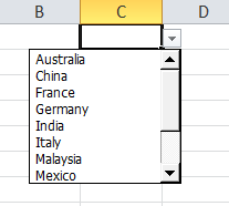
7. Once this is done, you will see a drop down arrow showing up in the cell C1. You will see the list of countries showing up here.
Once you have selected a value, it will be displayed in cell C1. No mis-spelt values. No garbage. Pure, good, data validation at its best!
You could have your master list of countries on another sheet in the same workbook, or in the same worksheet. If you do not want your users to see the individual names, you could hide the sheet and even protect it from any changes. But these things will be covered in a separate lesson.
Hope this helps. Do post a comment if you enjoy this little tip!
Cheers,
Vinai
Are you facing any problem in using Excel? Any Question?
You have come to the right place. Tell us your needs. We’ll be glad to help you!
It is quite easy to show or hide columns in Excel. Simply select a column, and press Control + 0 . The column is hidden from the view. You can make it out because of a dark line separating the columns. If you hide the B column, you will only see column A & Column C, and it is apparent that column B is hidden.
To unhide, simply select both column A & Column C. Then right click and select Unhide. Column B is brought back into view.
This works great most of the time. And it works in showing or hiding rows too.
But the problem arises when you want to hide the first column – Column A. Now it is difficult to select 2 adjacent columns, and you are unable to Unhide Column A.
Steps to Display the Hidden First Column (Column A) in Excel
Press F5. The Go To dialog box will popup.
Key in the cell A1 in Reference, and press Enter.
The cursor would have moved to the cell A1, even if you can not see it. Do not worry.
Now go to the Home Tab (in Excel 2007, 10 & 2013)
Click on Format button – it is near the far end of the screen… toward the right side of the ribbon.
Choose Visibility > Hide & Unhide. Then select to Unhide Columns.
Unhide columns or Rows in Excel
Voila! You will now be able to see the column A. It has been un-hidden.
It is a simple trick. Excel is all about simple tips and tricks… The more you practice, the more you try, the more gold shall ye find!
Cheers,
Vinai Prakash
Are you facing any problem in using Excel? Any Question?
You have come to the right place. Tell us your needs. We’ll be glad to help you!
Enter your name and email & Get the weekly newsletter... it's FREE!
Learn Simple Tricks To Be an Excel Expert!
BONUS: Get 30 Free Tips & Excel Shortcuts eBook Free!
Your information will *never* be shared or sold to a 3rd party.